Brief and visual exploration
We clarify audience, positioning, competitors, and the environments where the mark must appear.
Built for what’s next.
09 / DESIGN & BRANDING
A distinctive mark with room to work.
We design logos that express a clear idea and remain useful across small screens, large surfaces, light and dark settings, and the everyday work of a growing brand.
01 — THE OPPORTUNITY
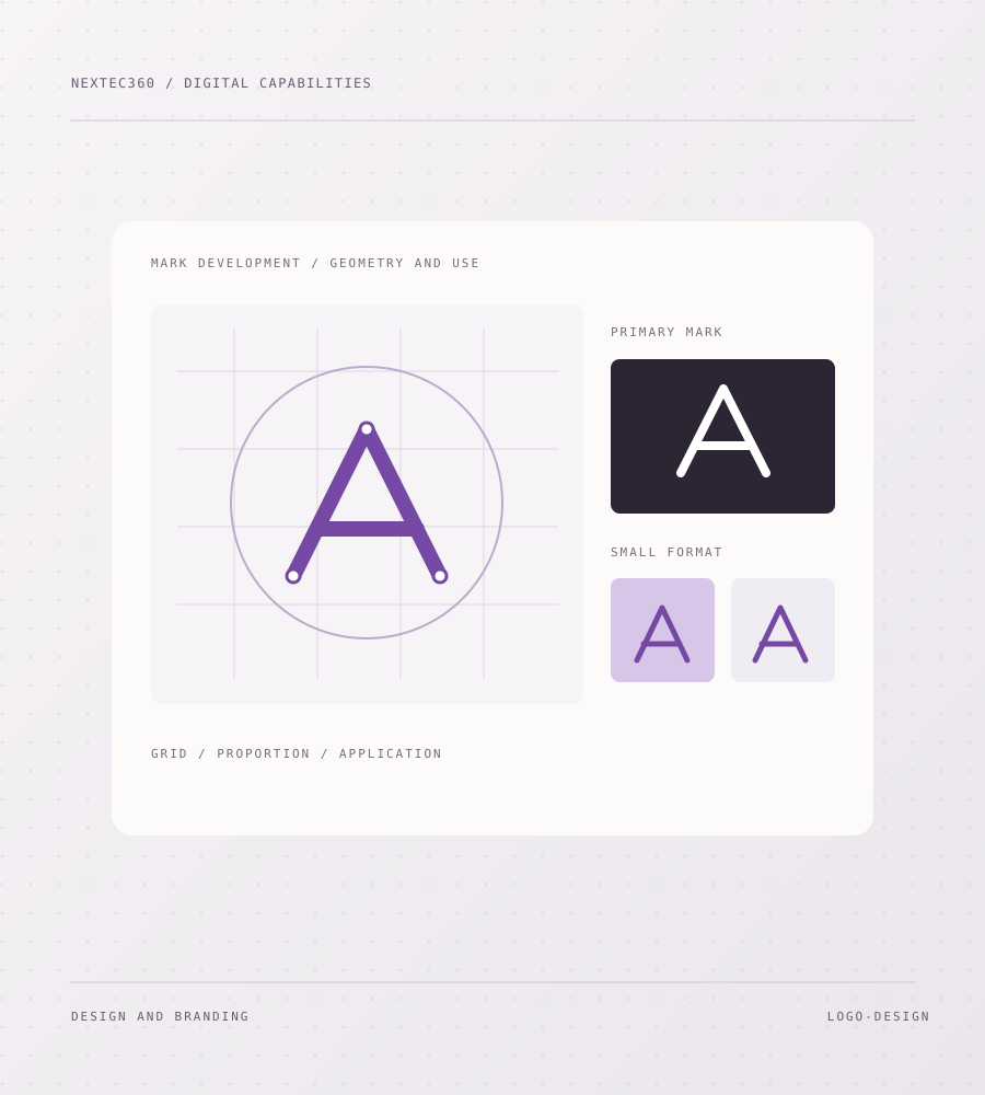
A logo must be recognizable and practical, not just attractive in one mockup. We consider proportion, simplicity, contrast, and usage before refining a final direction.
02 — THE WORK
Practical work shaped to the brief, with clear outputs at each stage.
We clarify audience, positioning, competitors, and the environments where the mark must appear.
We explore distinct routes, test their underlying ideas, and refine the strongest direction through feedback.
We prepare appropriate primary, compact, single-color, and light/dark applications where the design calls for them.
We provide practical file formats and basic rules for size, spacing, color, and incorrect usage.
03 — ILLUSTRATIVE STARTING BRIEF
A growing brand needs a logo that remains legible on a small screen, a document, and a physical sign.
Explore distinct concepts, refine one direction, and prepare usable versions with clear spacing and color rules.
An example of how we might frame a project, not client work.04 — THE APPROACH
Every project has its own scope. These stages make the work understandable and reviewable from the start.
We agree on what the mark should communicate and where it will be used.
We present considered concepts with the reasoning behind each direction.
We improve form, spacing, and legibility while testing realistic applications.
We package final variants and usage notes for digital and print settings.
We define the scope and useful outputs before building. You can review the direction as it develops, and we plan the handover around the people who will own the result. If a different tool or smaller solution is the better fit, that belongs in the conversation too.
06 — PRACTICAL QUESTIONS
The details of a good engagement are specific. Here are a few of the questions we work through early.
A logo project can stand alone when the wider visual system is already defined. If type, color, and applications are also unresolved, a full identity project is usually more useful.
We test a single-color version as part of practical use. If the mark relies on effects to remain recognizable, it needs more refinement.
The final handover can include scalable vector files and web-ready exports, with the exact set agreed for your intended uses.
HAVE A PROJECT IN MIND?
Tell us what you are trying to improve. We’ll talk through the scope, the decisions to make, and the most sensible first step.