Position and visual direction
We review the audience, market context, and qualities the identity must communicate before exploring design routes.
Built for what’s next.
08 / DESIGN & BRANDING
A visual system people can recognize and use.
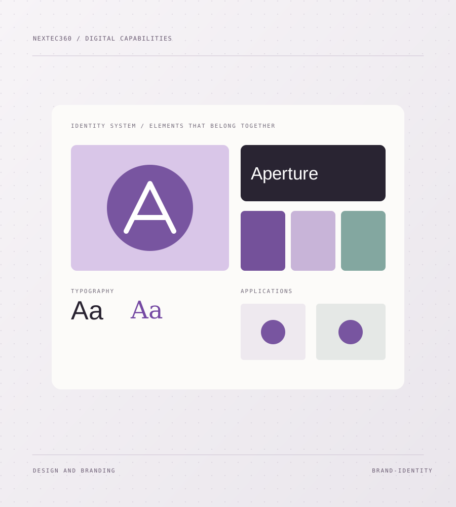
We create the rules and assets that help a brand look and feel consistent, from its core visual idea to the places customers meet it every day.
01 — THE OPPORTUNITY
When typography, color, imagery, and layout change from channel to channel, even good work feels disconnected. We make a coherent system that gives your team enough direction to create new material without losing the thread.
02 — THE WORK
Practical work shaped to the brief, with clear outputs at each stage.
We review the audience, market context, and qualities the identity must communicate before exploring design routes.
We develop the logo relationship, palette, typography, graphic language, and image direction as one system.
We test the identity on relevant formats such as a website, social posts, documents, presentations, or packaging.
We prepare usable assets and concise rules for color, type, spacing, imagery, and common applications.
03 — ILLUSTRATIVE STARTING BRIEF
A business looks and sounds different across its website, sales material, and social channels.
Define a visual direction and practical rules for type, color, imagery, and application across touchpoints.
An example of how we might frame a project, not client work.04 — THE APPROACH
Every project has its own scope. These stages make the work understandable and reviewable from the start.
We learn what the business does, whom it serves, and what it needs the identity to signal.
We develop and compare visual routes against the brief rather than judging isolated graphics.
The chosen direction becomes a set of connected rules and practical applications.
We prepare files and guidance so the identity remains usable beyond the launch project.
We define the scope and useful outputs before building. You can review the direction as it develops, and we plan the handover around the people who will own the result. If a different tool or smaller solution is the better fit, that belongs in the conversation too.
06 — PRACTICAL QUESTIONS
The details of a good engagement are specific. Here are a few of the questions we work through early.
A logo is one recognizable mark. Identity includes the wider system of type, color, imagery, layout, and rules that makes all brand material feel connected.
Yes. We can retain the strongest recognizable parts and improve the elements that no longer work across current channels.
The handover should include practical usage guidance and the files your team needs. Exact formats are agreed around your channels and internal workflow.
HAVE A PROJECT IN MIND?
Tell us what you are trying to improve. We’ll talk through the scope, the decisions to make, and the most sensible first step.